This month I was learning on my own instead of taking a class, so I know I didn’t do as thorough a job as if I had the guidance of a professional/someone forcing me to do things. Still, I consulted a lot of professionals, in the form of taking their books out from the library:
Sources (Books)
Modern Calligraphy by Molly Suber Thore
Spencerian Handwriting by Platts Roger Spencer
Simple Stroke Calligraphy by Marci Donley
Encyclopedia of Calligraphy Techniques by Dana Hardy Wilson
Calligraphy by Margaret Morgan
Calligraphy in Ten Easy Lessons
Step by Step Calligraphy
Mastering Calligraphy by Gaye Godfrey-Nicholes
Of these, I liked the first one, Modern Calligraphy, the best. It went really in-depth about supplies and what to look for, explaining where you really do need to spend some money and where it’s okay to cheap out, especially for beginners. I also had this amazing Christmas present from Melissa:
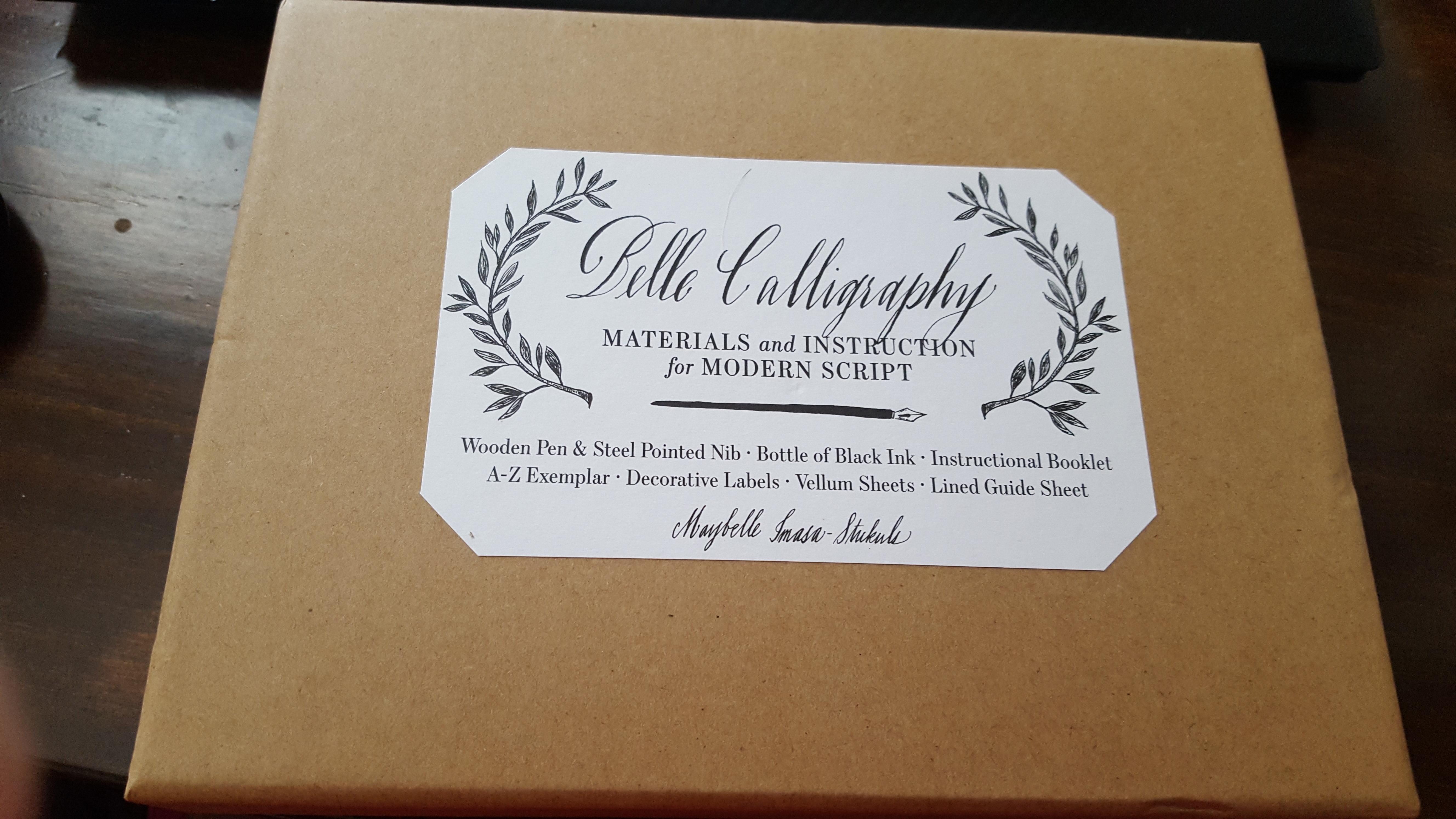
A calligraphy kit!
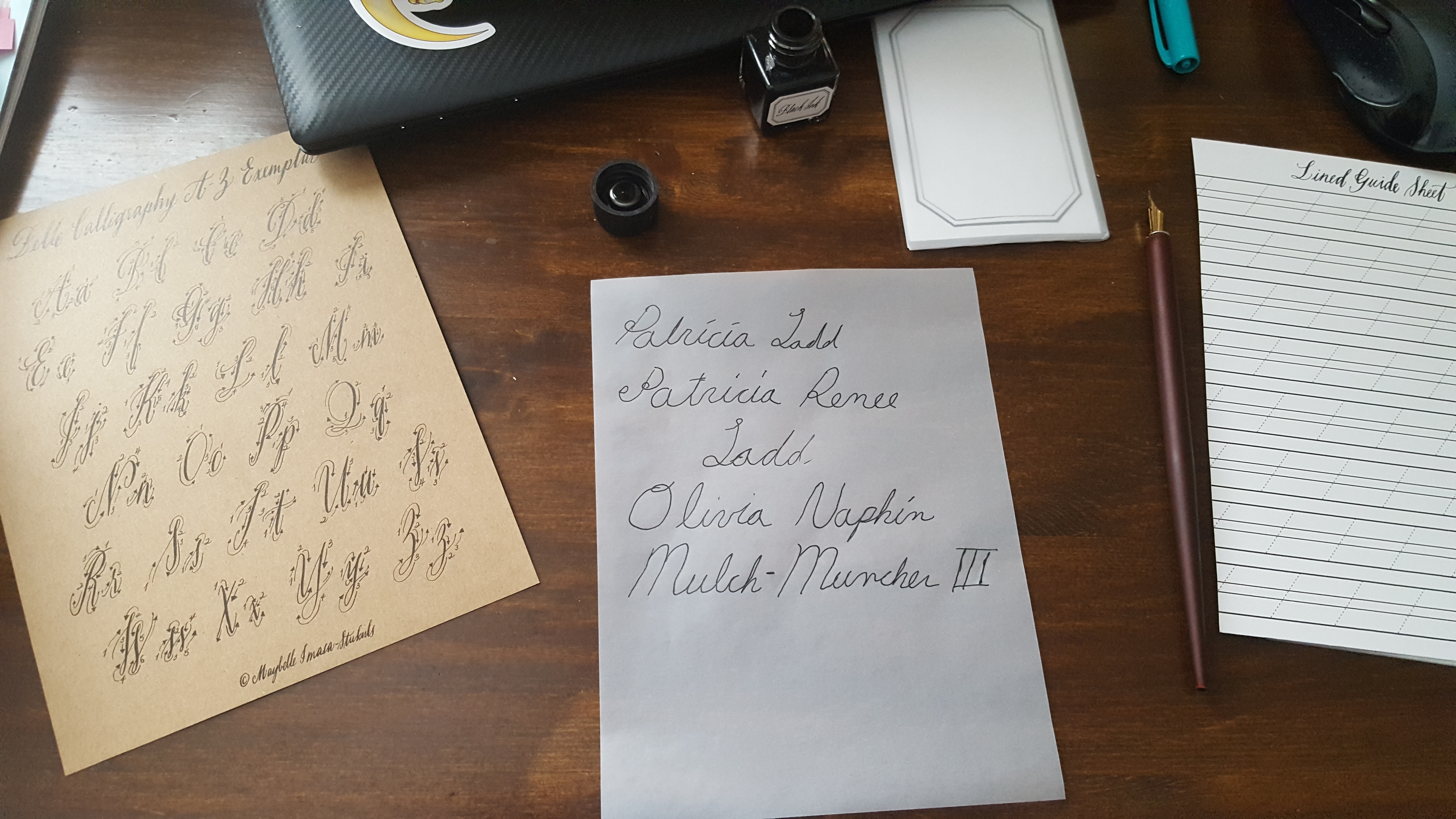
It had a good practice booklet, pen, ink, and vellum. It was nice to have the basic supplies already. Here’s a practice booklet:
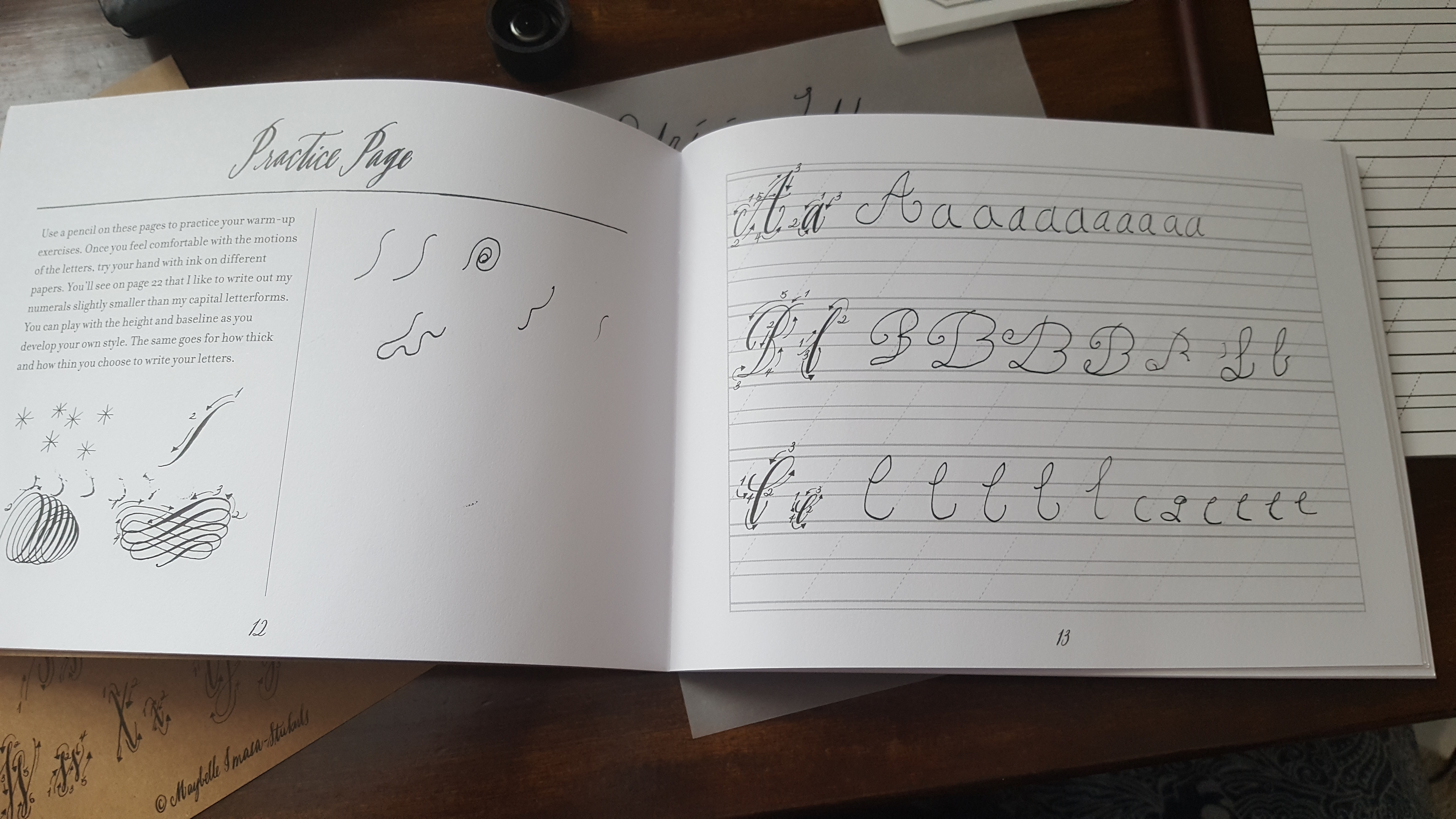
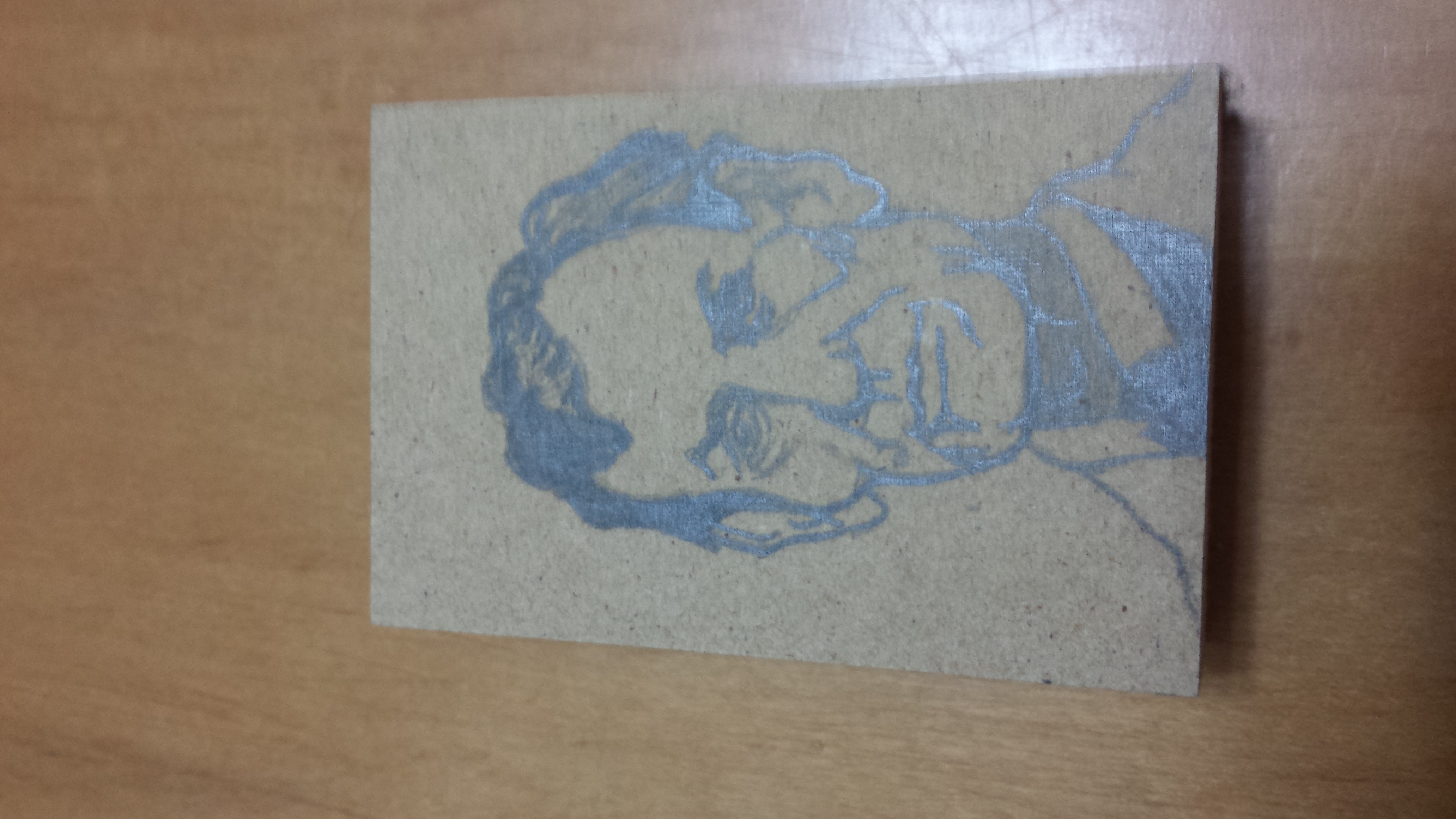
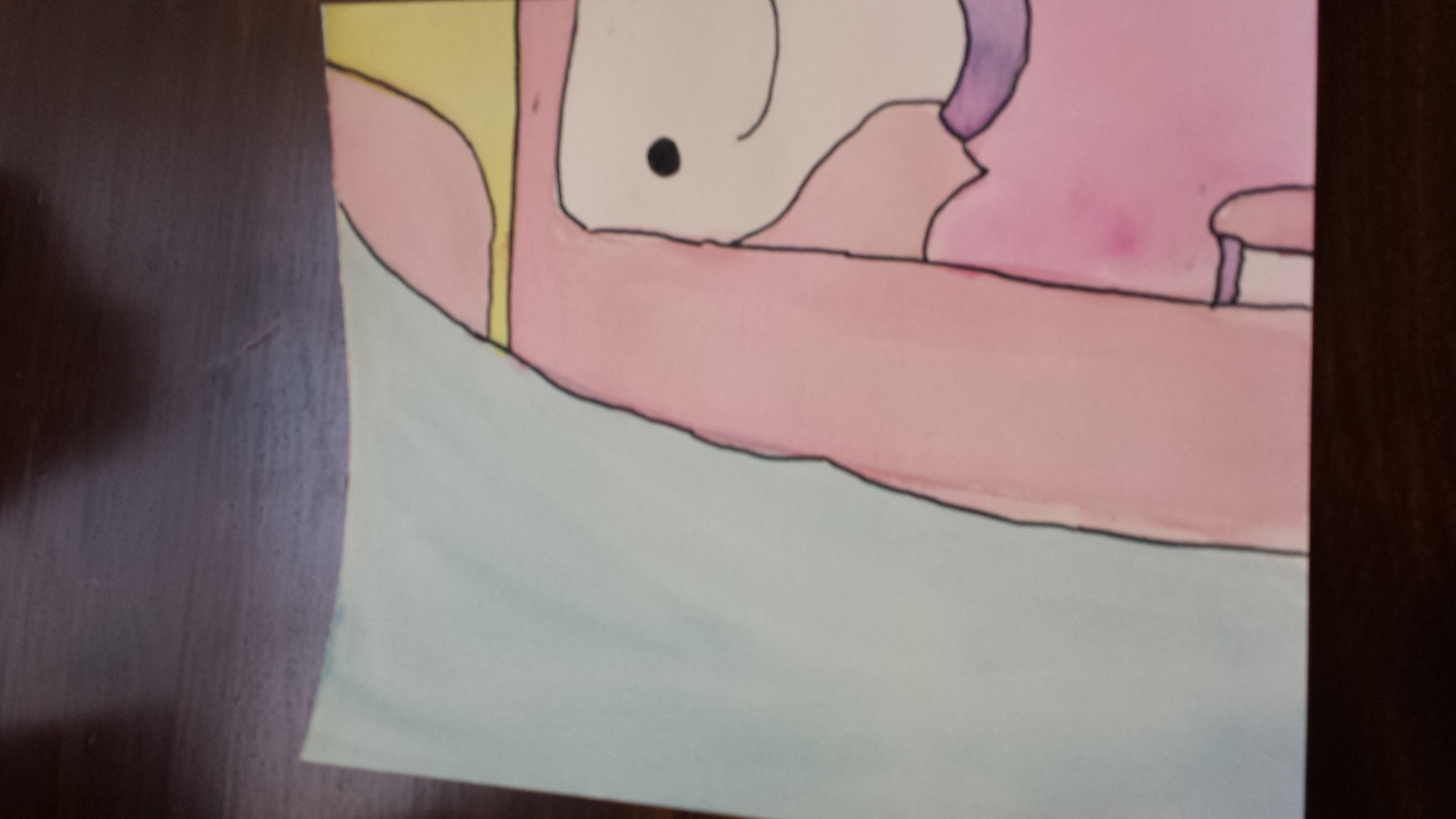
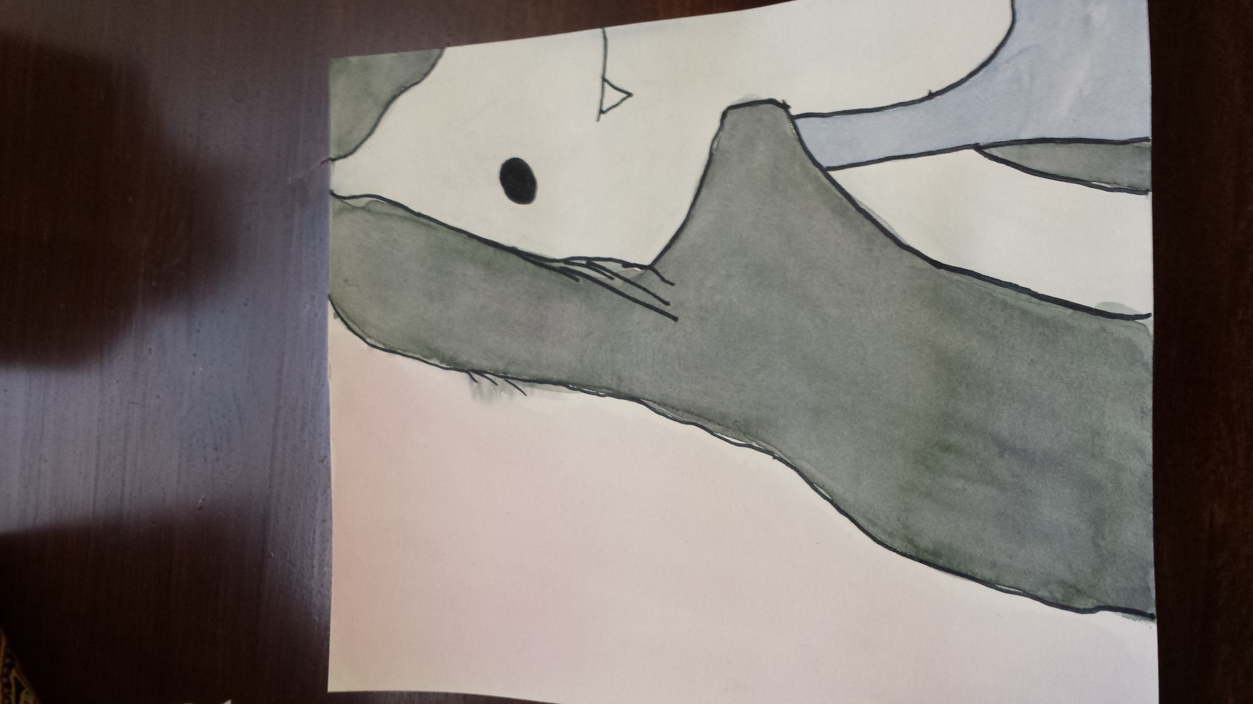
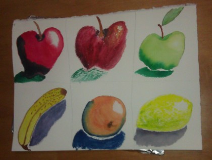
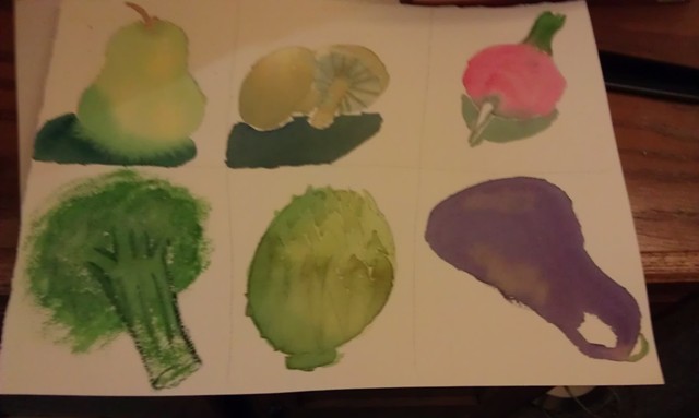
As you can see, my lack of artistic skill is definitely a drawback
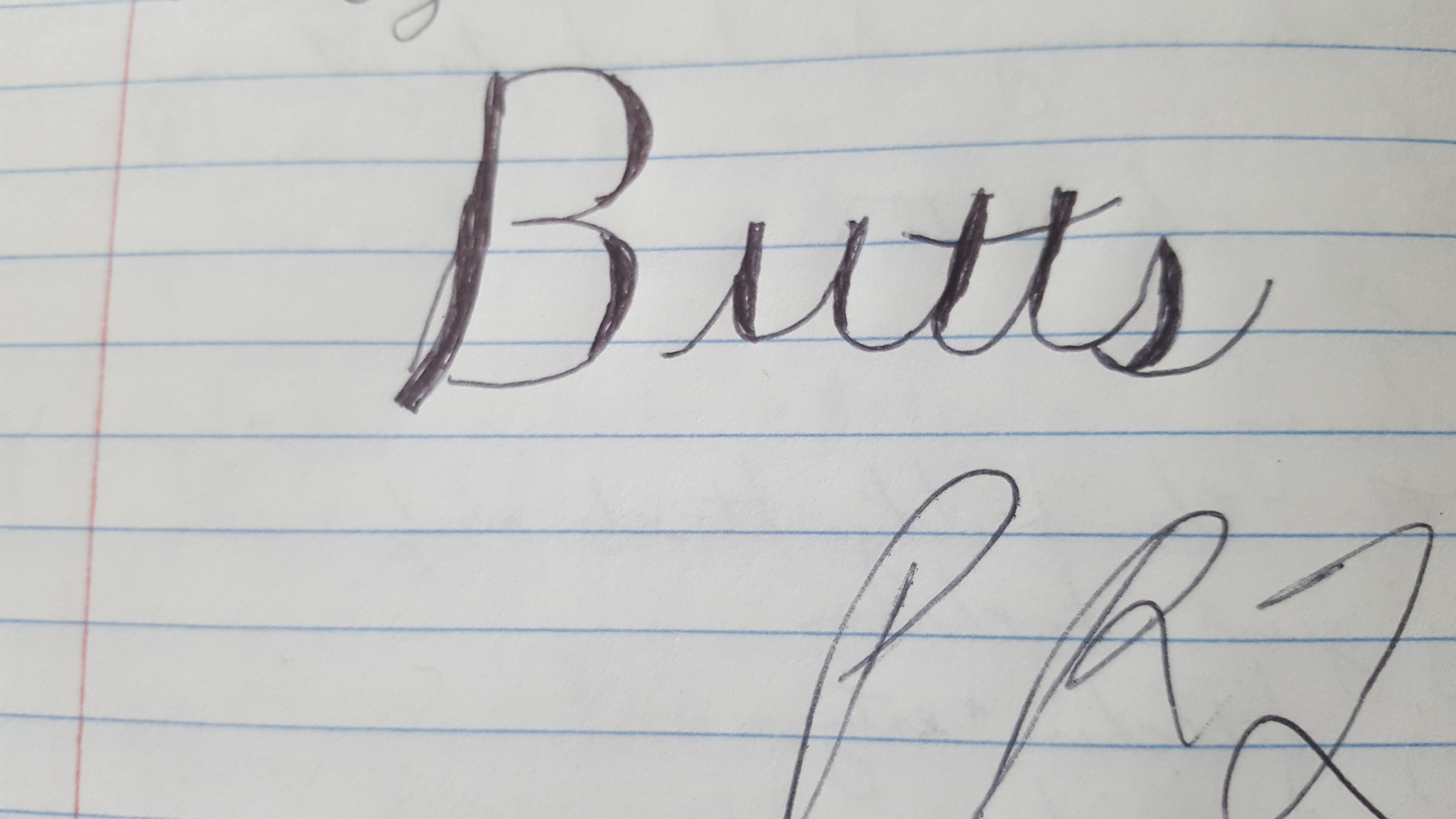
I also can’t seem to get the thin vs thick lines that really define calligraphy. It’s all about the pressure you exert, which I suppose I could get with more practice:
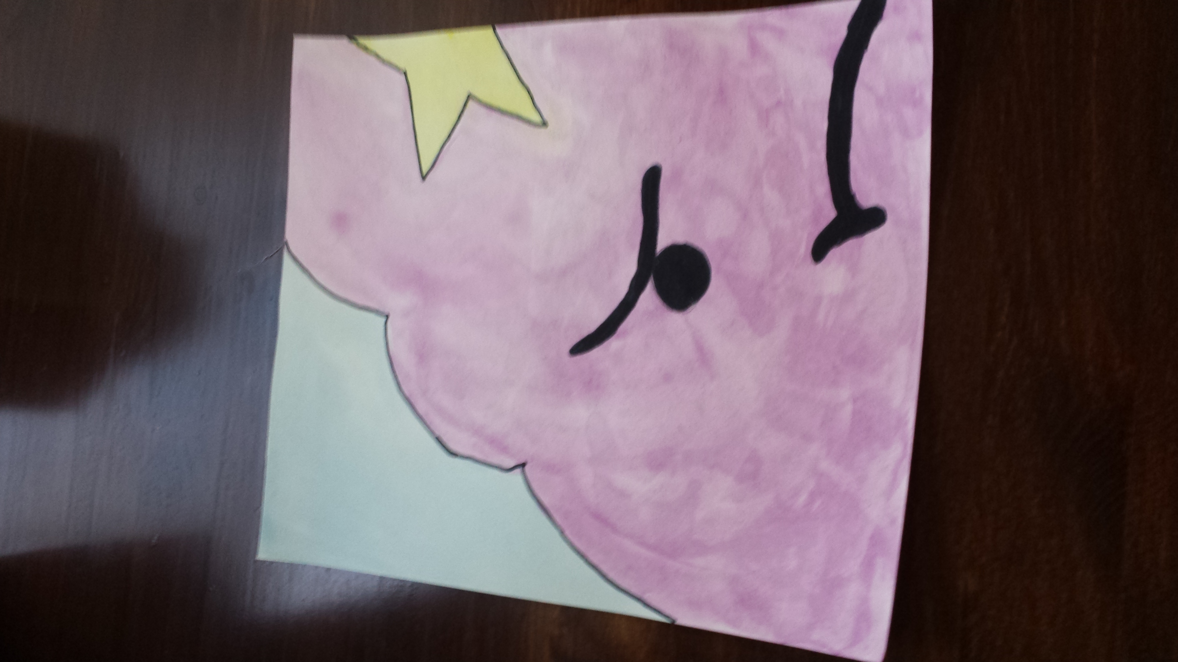
My handwriting will always look kind of awkward to me, I guess
I’m probably not going to get more practice, though, because I discovered this month that, though I like the results of calligraphy, I don’t really like doing it, particularly. It’s fine, but I don’t have the drive to put in the time and effort I’d need to actually get good at it.
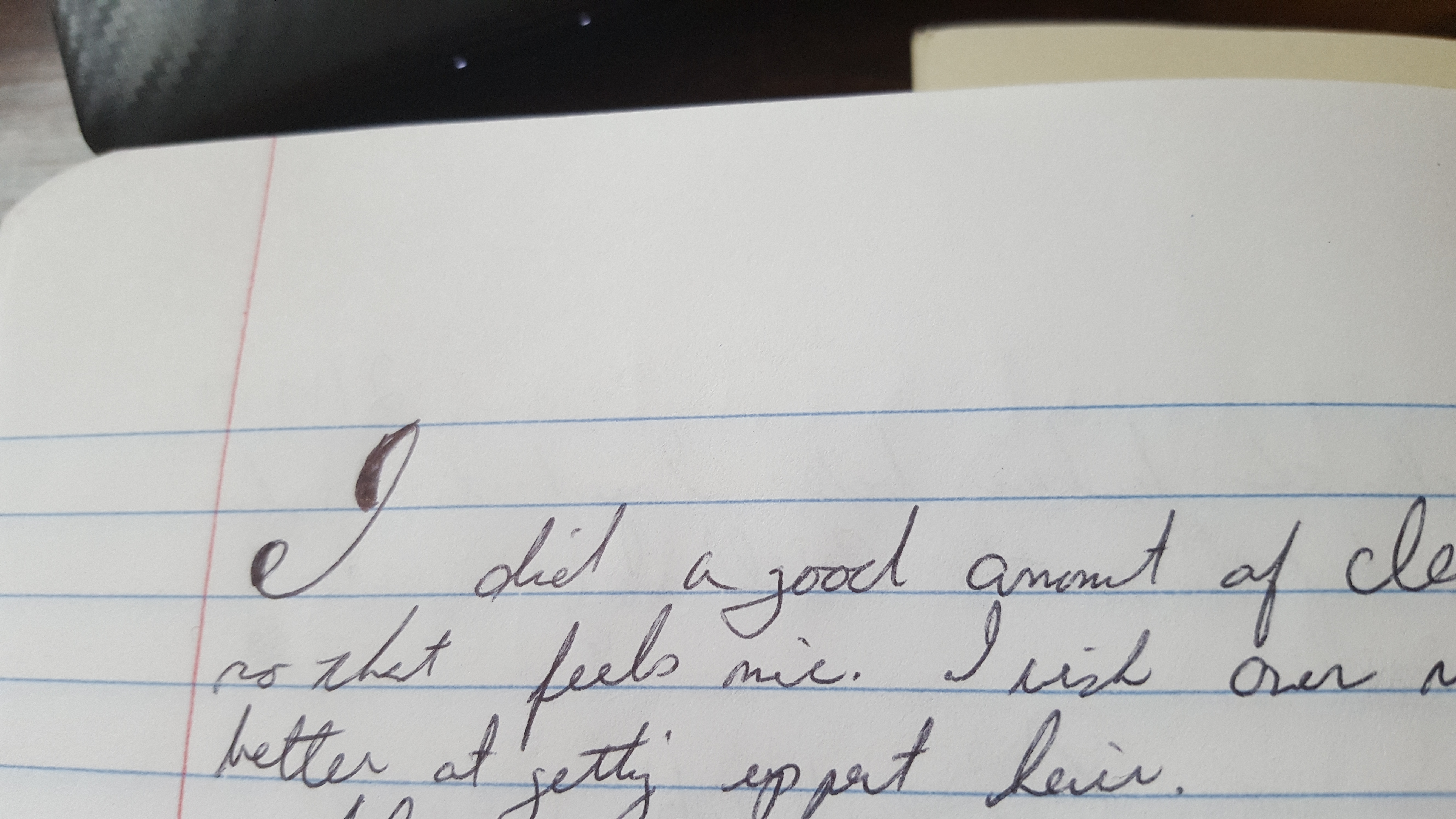
HOWEVER, one of the online sources I consulted, The Postman’s Knock, had an awesome tutorial about how to do CHEATING CALLIGRAPHY!! I am all about cheating, y’all. You can do it with a ballpoint, which I write in my journal with all the time. I immediately started practicing.
What would you have tried first?
I write fast, which is probably why my handwriting is largely illegible. But for this you have to slow down, so I’m hoping I’ll at least take that lesson away from it to improve the quality of my journals in general, if not have them in beautiful Spencerian hand like I maybe naively hoped would happen this month.
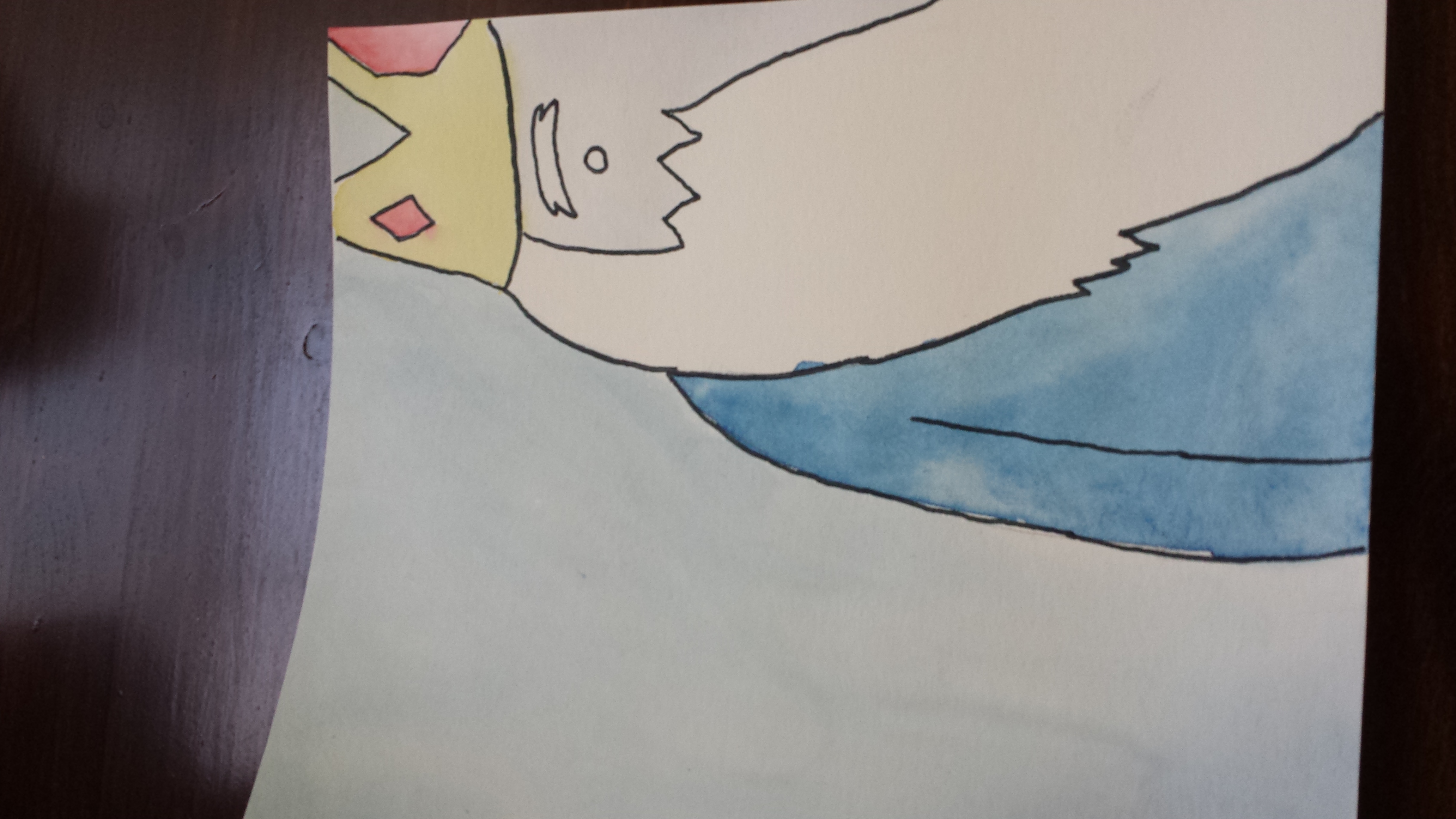
I’ve started doing the first letter of each entry, like I’m important or something
I’m glad I took this month to play with calligraphy since it’s something that’s always interested me. Now I know all I want to about it, and I don’t have to wonder anymore. Plus, I think it’s improved my writing in some little ways.
Best Part: Livening up my journal!
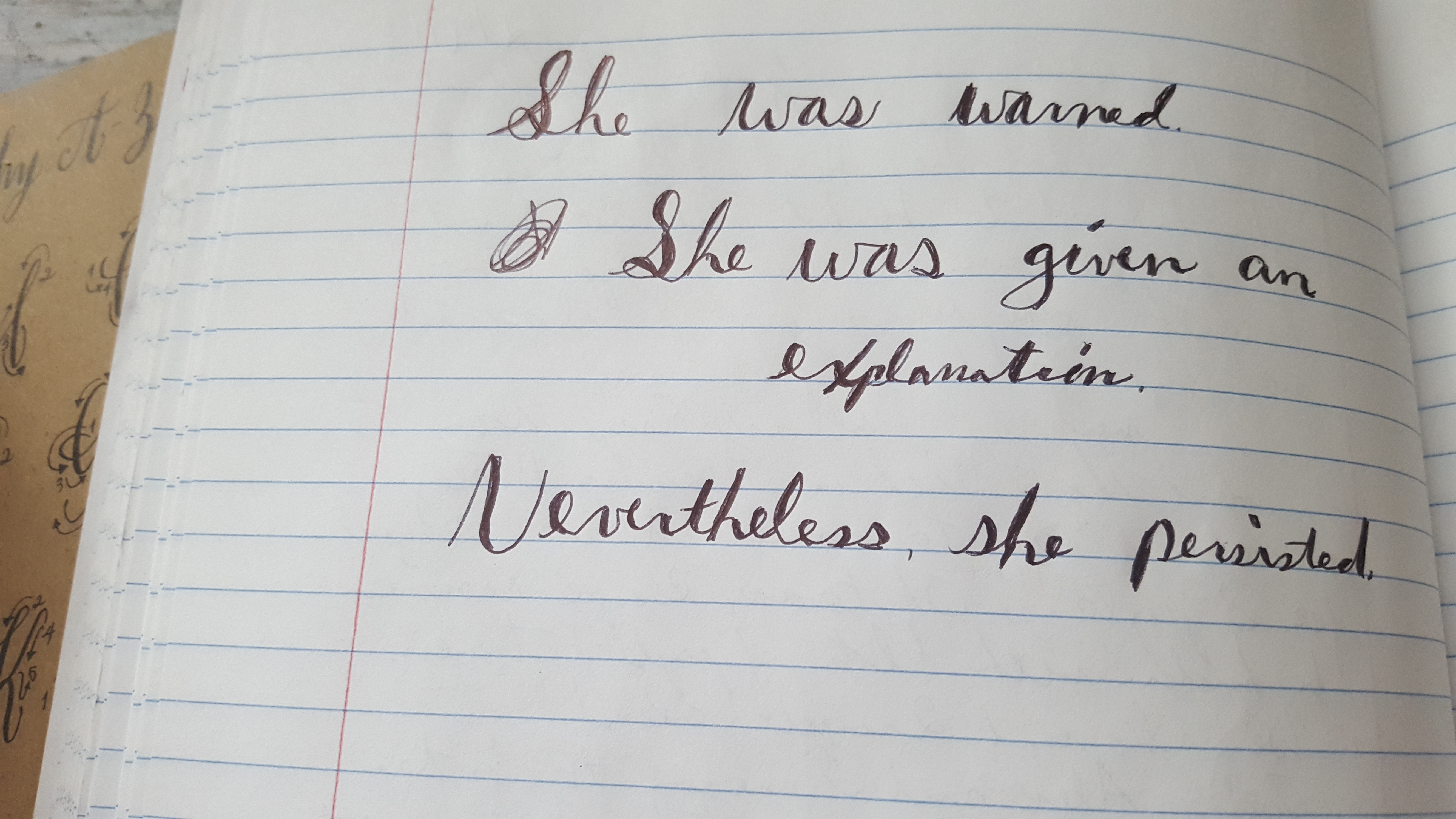
Like this!
worst Part: Sucking at drawing means sucking at calligraphy
Will I do this again?: Nope
Not sure what my plan for next month is yet, but I’m tentatively saying rock climbing!
Previously: Beginner’s Guide to Weaving
Next: Cross Stitch (not rock climbing at all lol)